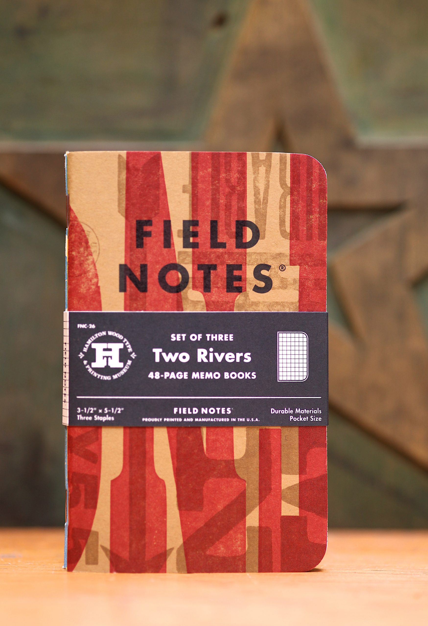
I’m often asked, “what’s your favorite Field Notes edition?,” and while my list varies from time to time, number one is definitely “Two Rivers.” It was the most complicated editions we’d done at the time, taking several months to plan and produce, as compared to our usual quarterly schedule, and it remains the most hands-on, hand-made edition to date.
I’d been fascinated with letterpress printing since seeing Bruce Licher’s work in Emigre and other design magazines in college. I got a small taste of printing in studio class (and wasted most of it cleaning up my pied drawer of 14pt Garamond Italic). Throughout the nineties, I was enamored with the album covers and posters produced by John Upchurch’s Fireproof Press in Chicago. I had the pleasure of working with Bruno Rohner for a Cuervo marketing project, his exotic machinery enticed my co-worker Bob Atkins to run off to work for Rohner, and to later establish his own shop in Kansas City.
In the early days of Field Notes, we talked to Bob about a letterpress collaboration, but (largely because of the distance) ended up working with the (slightly) more local Dan Barron at the (sadly defunct) Flywheel Press. Every time I ended up in a letterpress shop, I became more interested in it, and when Matt Jorgensen suggested working with (and to benefit!) the Hamilton Wood Type and Printing Museum in Two Rivers, Wisconsin, I couldn’t have been more excited.
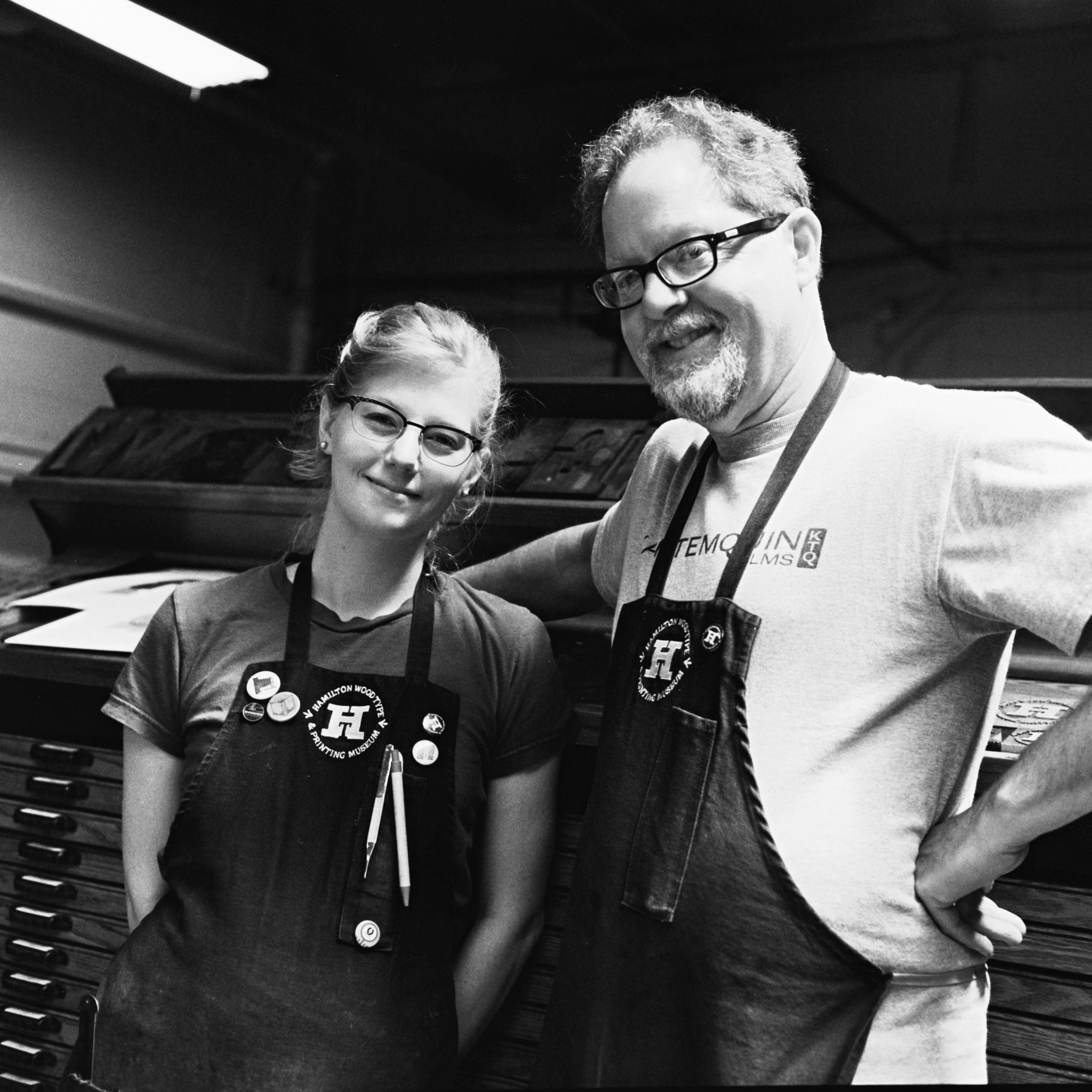
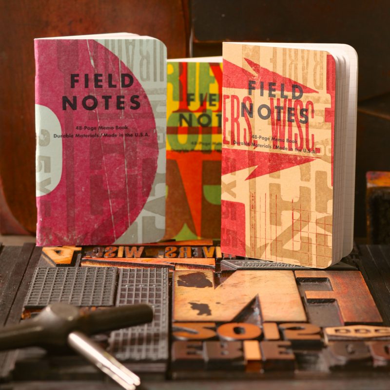
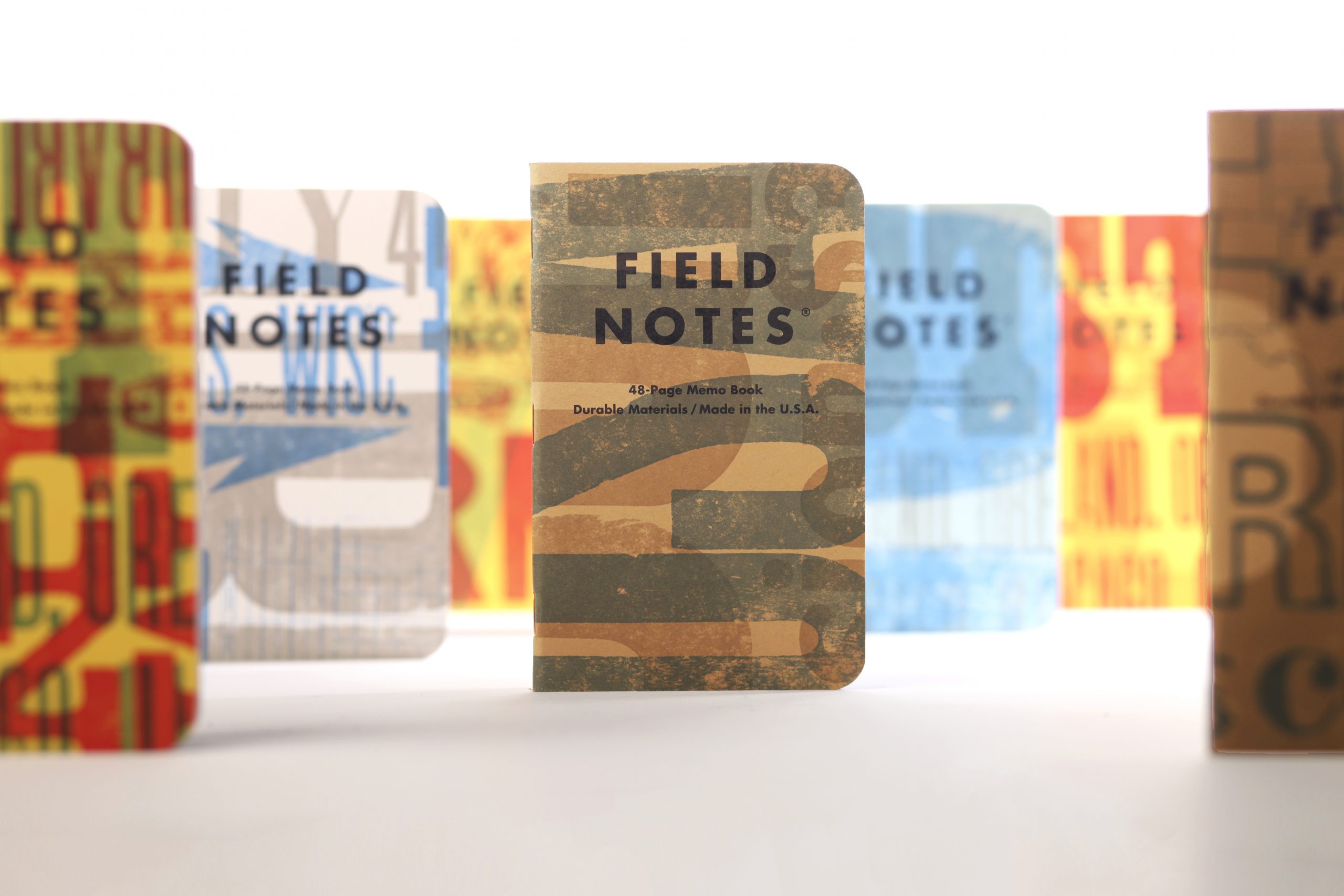
My expectations about the museum were nothing compared to the reality. Jim Moran and Stephanie Carpenter immediately made us feel at home and we left our first meeting excited and inspired. Over the summer of 2014, Matt, Aaron Draplin, and I visited the museum several times to get our hands dirty setting the type and images that would serve as the covers of the books. Jim spent months of late nights printing tens of thousands of covers on an old Heidelberg windmill while Stephanie devised an organizational system to mix the four French papers, three inks, and seven formes (in various rotations) to create thousands of different versions.

In the end, the books came out even better than I’d imagined, and my curiosity about letterpress was turned into infatuation. Matt and I visit Hamilton regularly and have met dozens of wonderful, friendly printers in the letterpress community, eventually leading up to Field Notes’ even-more-ambitious “United States of Letterpress” edition. Jim and Stephanie have become good friends, and while I largely remain a dilettante when it comes to the actual nuts and bolts of letterpress printing, I’m working to change that.